scellop: A Scalable Redesign of Cell Population Plots for Single-Cell Data
Abstract
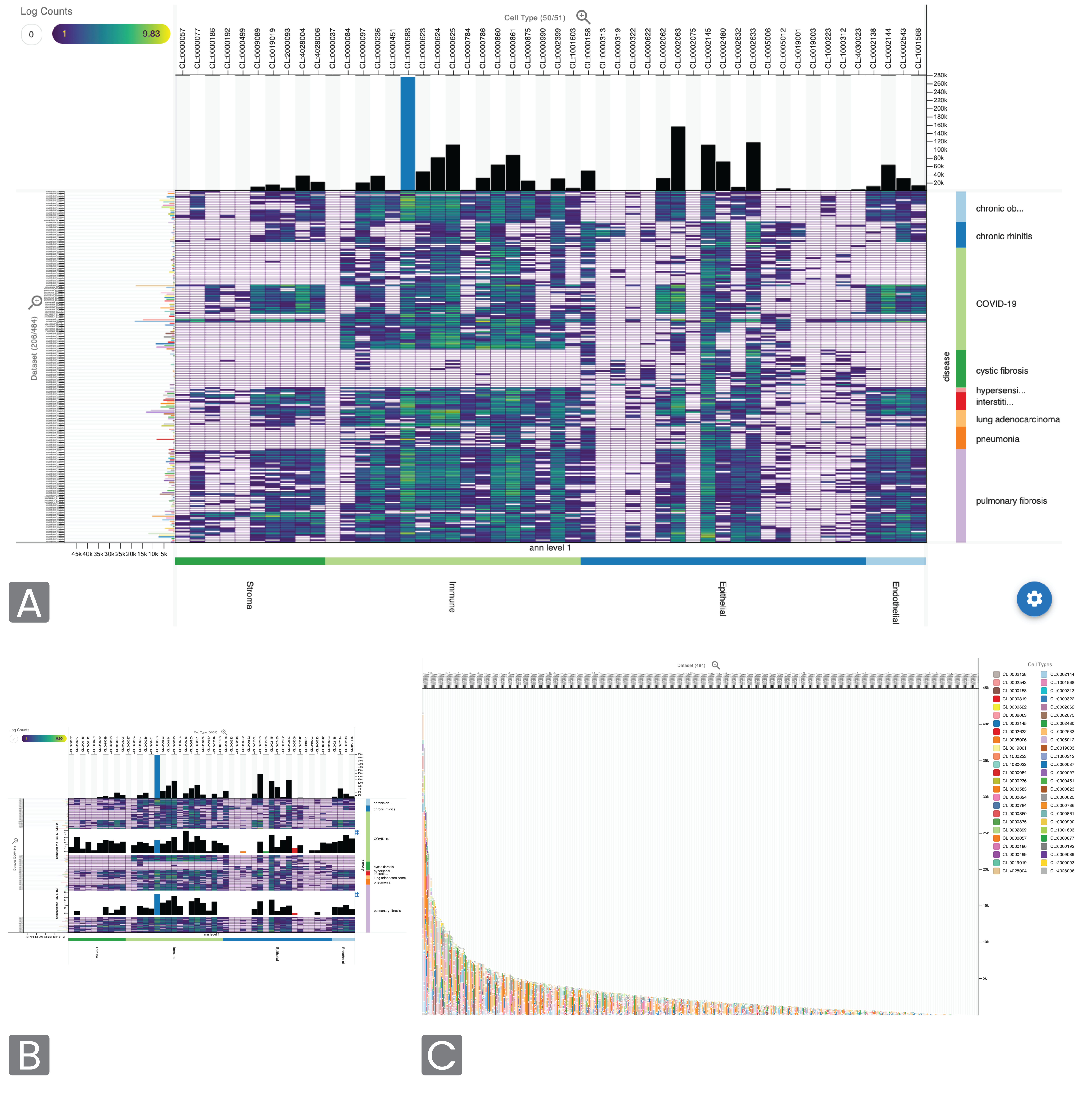
Summary: Cell population plots are visualizations showing cell population distributions in biological samples with single-cell data, traditionally shown with stacked bar charts. Here, we address issues with this approach, particularly its limited scalability with increasing number of cell types and samples, and present scellop, a novel interactive cell population viewer combining visual encodings optimized for common user tasks in studying populations of cells across samples or conditions. Availability and Implementation: Scellop is available under the MIT licence at https://github.com/hms-dbmi/scellop, and is available on PyPI (https://pypi.org/project/cellpop/) and NPM (https://www.npmjs.com/package/cellpop). A demo is available at https://scellop.netlify.app/.
Citation
TC Smits, N Akhmetov, TS Liaw, MS Keller, E Mörth, N Gehlenborg. “scellop: A Scalable Redesign of Cell Population Plots for Single-Cell Data”, arXiv (2025). doi:10.48550/ARXIV.2510.09554