Research Projects
The following list is a sample of research projects that the lab is involved in.
Active
|
4D Nucleome Data PortalCollect, store, curate, display, and analyze data generated in the 4DN Network. |
|
Cistrome ExplorerWeb-based Interactive Visual Analytics Tool for Exploring Epigenomics Data with Associated Metadata |
|
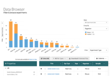
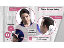
DiscoveryA tool for accessing and visualizing patient information from multiple providers. |
|
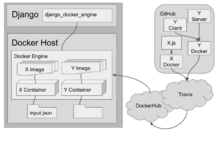
django-docker-enginedjango-docker-engine is a Django app that manages the creation of, and proxies requests to, Docker containers. |
|
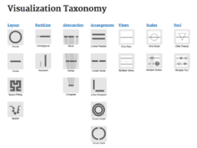
GenoCATGenoCAT provides a database of genomic visualization tools. Each tool has been sorted and grouped based on various attributes, and the website has been designed to help you find what you’re looking for. |
|
GoslingA Grammar-based Toolkit for Scalable and Interactive Genomics Data Visualization |
|
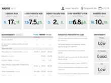
HalyosHalyos is a tool for patients to explore their EHR data. It is designed to present patient data in a way that allows patients to better understand their health data. |
|
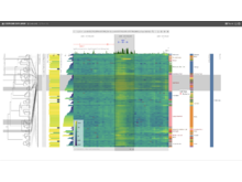
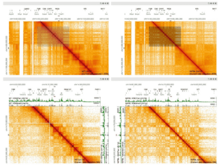
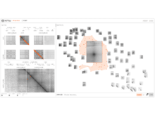
HiGlassHiGlass is a tool for exploring genomic contact matrices and tracks. It can be configured to explore and compare contact matrices across multiple scales. |
|
HiPilerHiPiler is an interactive visualization interface for the exploration and visualization of regions-of-interest such as loops in large genome interaction matrices. |
|
HuBMAP Data PortalCurate, display, and analyze data generated by the HuBMAP Consortium. |
|
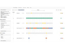
OncoThreadsOncoThreads is a visualization tool for longitudinal cancer genomics data. |
Precision VISSTAAn interactive visualization interface to explore time-varied mobile health and survey data, enabling precise recommendations for lifestyle modifications to improve inflammatory bowel disease (IBD) outcomes. |
|
|
SATORIAn ontology-guided visual exploration system that combines a powerful metadata search with a tree map and a node-link diagram that visualize the repository structure, provide context to retrieved data sets, and serve as an interface to drive semantic querying and browsing of the repository. |
|
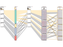
Caleydo StratomeXIntegrative visualization of stratified heterogeneous data for disease subtype analysis. |
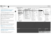
tableschema-to-templateGiven a YAML description of the data, generate an Excel template with input validation |
|

|
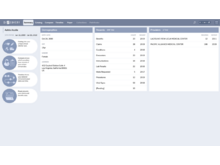
Universal Discovery Interface (UDI)Connect biomedical research data from thousands of sources and overcome barriers caused by incompatible data dialects. |
|
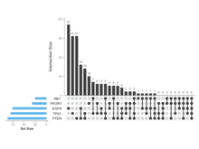
UpSetRAn R package to generate static UpSet plots. |
|
Data-Driven Visual ConsentData-Driven Visual consent is a tool for patients to understand the risk of pursuing a surgical intervention. The application calculates personalized risk scores using patient data and preferences and renders an intuitive visualization. |
|
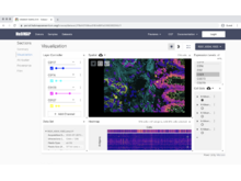
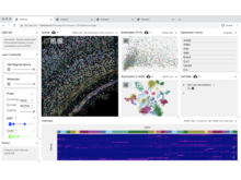
VitessceVisual Integration Tool for Exploration of Spatial Single-Cell Experiments |
|
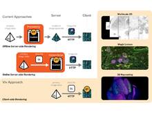
VivLibrary for Multiscale Visualization of High-Resolution Multiplexed Tissue Data on the Web |
Inactive
|
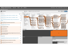
Refinery PlatformA cloud-based data management, analysis, and visualization platform for reproducible biomedical research.   |